Iterative testing and design of a digital-led health safety alerts experience
The opportunity…
Our program for people managing chronic conditions includes health safety alerts. These alerts use an algorithm that looks at blood pressure, pulse, and weight readings members log as well as trends in readings over time to identify when a member may be immediately unsafe.
Version one of the alerts system surfaced abnormal and critical alerts to the member’s primary care provider and a member of our company’s care team. This setup required a member of our company’s care team to call the member to gather more information and determine next steps to make sure the member was safe. Being able to accurately triage alerts with minimal human involvement could lower costs for our company and for our clients. It was essential that the solution still be effective at identifying potential acute episodes and reducing hospitalizations, and a digital-led solution would need to be safe and usable for our members.
Design challenge: How might we triage health alerts more efficiently and effectively?
My role: I was the lead UX Researcher embedded in the cross-functional program team with one Product Manager, a Designer, Clinical Lead, Content Strategist, and Engineer. I worked with the team to define research goals, developed the study plan and protocols, worked with design to develop stimuli, implemented recruitment, carried out sessions, completed analysis and research deliverables, led the team in debriefs and learning, and brought the user perspective into team meetings and decision-making.
Types of research: Formative, iterative, summative, remote moderated
Design phases: Ideate → Define → Develop → Test → Launch
Methods and tools: Desk review, content testing, iterative testing and design with a prototype, summative testing for regulatory compliance
To design a solution, the team needed to understand…
This feature set was on the product roadmap for post-MVP release, and we had done a lot of the initial UXR and design legwork in the foundational phase. I took time with the PM to work together on defining the key user needs and risks related to this feature set. Then, we shared them our regulatory and quality stakeholders to lay a solid foundation for this research to tee us up for summative testing the final solution. We coordinated with engineering and design to ensure that the UX we were testing was feasible with the development resources available. Based on this, we aimed to address the following research questions:
How receptive are potential members to a digital-led alerts experience?
To what extent do proposed features and the overall feature set align to known user needs? Where might there be gaps?
Where might there be potential usability issues in relation to known risks, and are there any potential additional risks to user safety we haven’t considered?
So, I developed a research plan…
with an iterative design. We had limited time to implement the research and finalize designs before the design handoff. An iterative approach would unblock design and content stakeholders and enable them to implement changes based on our learnings as we went, instead of having to wait for me to analyze what we learned and put together the UX research deliverables. A key risk to user safety in using a digital-led solution to triaging alerts was misunderstanding the content and providing information that could lead to inaccurately deescalating an alert. I included content testing methods to assess the understandability and comprehension of key content and questions.
Because we were implementing this research during the COVID-19 pandemic, I implemented the research remotely using the User Interviews platform for recruitment and the dscout platform for sessions.
We implemented…

Desk review of UXR learnings
I reviewed previous UXR learnings from foundational research and summative testing to identify and surface relevant existing insights to the team.

Summative testing
Because the product was classified as Software as a Medical Device, we also carried out summative testing on the final alerts experience to assess that the product met safety and usability requirements for regulatory compliance.

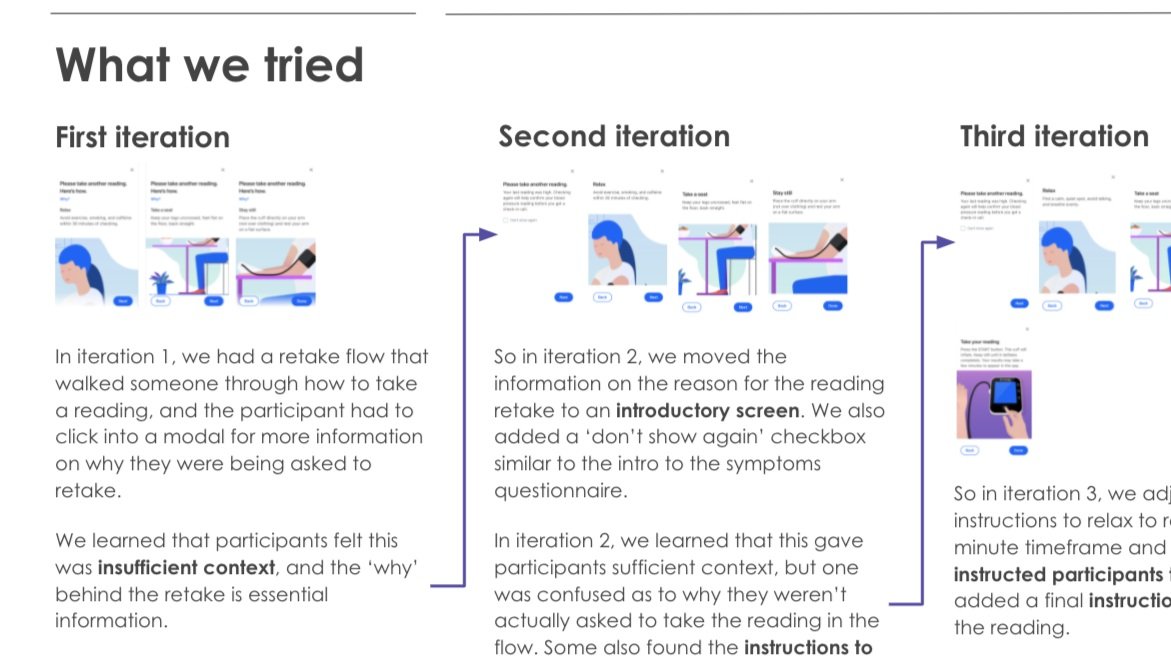
Iterative testing and design
60 minute moderated semi-structured interviews with 11 individuals living with heart failure. Participants navigated a medium-fidelity prototype and were asked to complete key tasks.

Content testing
The sessions also included content testing of the copy on each screen of the prototype.
I got buy-in from my key stakeholders who would need to work together to implement an iterative testing approach. The designer and content strategist agreed to participate in debriefs after every 1-2 sessions to talk about what we had learned and decide whether to iterate, and the broader team of stakeholders such as our PM, engineer, and clinical lead agreed to participate in debriefs as needed to provide their input.
This wasn’t cut and dry RITE-style usability testing, so a hard and fast rule of iterating after a specific number of sessions or iterating the first time an issue came up wasn’t appropriate for some of the more nebulous items we were evaluating like content comprehension. I created this decision tree to help the team navigate deciding when we should iterate.

We identified key research themes…
A digital-led health alert experience aligned well to users’ mental models around managing health-related risk.
Not all patients are the same. What’s considered ‘okay’, triggers and symptoms, and what an acute episode looks and feels like can vary widely from one patient to another.
Participants didn’t want the experience to be overly alarmist, but they also didn’t want us to keep any information that might help them better assess or understand their health from them.
Not everyone understands their condition, and users want to build their understanding of their own bodies, symptoms, and triggers to help them better manage their condition.
For people managing chronic conditions, very few situations are black and white. Each person has their own experiences, context, and beliefs about what is an dis not okay for them. Participants wanted help interpreting data and identifying things that might warrant further attention, as well as guidance and suggestions on what they should do next, but would also use their own judgement.
To socialize learnings…

Session observers
By inviting observers to sessions, my team got first hand observations of what we were learning in the study. They watched participants struggle to understand terminology, or get stuck in confusion on what would happen next.

Post-session debriefs
The post-session debriefs were another opportunity to socialize learnings. We were each able to bring our own unique perspectives - design best practices, content strategy and experience, and my depth of understanding of our users based on this and previous UXR studies.

Shareout presentation and deck
After concluding the study, I prepared a deck documenting the study and what we had learned, including high-level north star experience takeaways as well as documentation of what we tried and learned and recommendations for Design, Content, Clinical, and Product stakeholders. I held a learning workshop with the core team, and also presented key study learnings to the broader organization at our quarterly UXR review.
And as a result of the research…
Based on our learnings, design and content made considerable changes to the UX throughout the iterative testing process. By the final few sessions, we were seeing comprehension and task completion at satisfactory levels to give positive signals for user safety and anticipating passing summative testing against regulatory standards.
There were some clear improvements that could be made to the experience that were out of scope to address in the GA release based on development resources, which informed feature prioritization for the product roadmap - for example, offering an SMS-based version of the symptom collector flow, and increased personalization like member-specific targets and thresholds for ‘normal’ and abnormal readings surfaced in the digital experience.
Learnings also continued to inform a clear and distinct design, content, and UX strategy. For example, based on these learnings and building on foundational learnings, the roadmap prioritized: supporting members with real-time data interpretation; calling out things that might be off in the UX while developing a design approach to balance that with ensuring users aren’t triggered into a state of panic or alarm; and education to build trust with users. For example, ensuring the UX clarifies things like how we decide the range/threshold for a normal vs. abnormal reading, what different symptoms have to do with heart failure, and what else could trigger a high BP reading (i.e. a salty meal, stress, missing a medication, etc.).